Edward Snowden blows the whistle

130614 Edward snowden blows the whistle_i

A man, not a boy.

http://www.guardian.co.uk/world/2013/jun/09/nsa-whistleblower-edward-snowden-why

Hopefully they don’t kill, torture or detain him for telling the truth.

Luckily he has much better constellations than Manning. Jupiter transit his Mars. A big new beginning for him and many involved.

Veröffentlicht unter general | Hinterlasse einen Kommentar

Ich brauche also nicht die Entscheidung von Angela Merkel

Weg in die Selbstbestimmung für Dummies

Weg in die Selbstbestimmung für Dummies

Ken Jebsen hat den Unterschied zwischen Fremdbestimmung und Selbstbestimmung sehr schön erklärt:

„Es ist falsch, Angela Merkel die Schuld zu geben. Diese Schuld, die Angela Merkel hat, oder einige ihrer Minister, die hat auch eine Funktion, denn solange Angela Merkel schuld ist, sind wir alle unschuldig. Das ist die soziale Funktion. Das sind wir nicht. Wir sind alle schuld, weil wir das ja zulassen. Angela Merkel kann nicht unser Leben bestimmen. Wenn Angela Merkel Monsanto verbieten würde, es gäbe keine Monsanto Produkte mehr in Deutschland, dann würde jeder einzelne was tun? Er würde keine Monsanto Produkte mehr essen. Das wäre aber dasselbe was er tun würde ohne die Entscheidung von Angela Merkel. Ich brauche also nicht die Entscheidung von Angela Merkel.

Ken FM, 26.05.2013, Marsch gegen Monsanto Demo, Berlin

Hier nochmal das Video (Minute 2:20):

Veröffentlicht unter doodle | Verschlagwortet mit , | Hinterlasse einen Kommentar

Then they came for me

Then they came for me

Then they came for me

Toay`s doodle is inspired by David Icke`s speech (min 1:30):

Veröffentlicht unter doodle | Hinterlasse einen Kommentar

Bilderberg 2013

Bilderberg 2013 -  Wovon man sich kein Bild machen darf

Bilderberg 2013 – Wovon man sich kein Bild machen darf

Auch 2013 verbergen sich die führenden Politiker, Konzernchefs und Medieneigentümer der Welt, die an der Bilderbergkonferenz teilnehmen, erfolgreich.

Die Journalisten werden wie die Schafe gehalten, wie ASR berichtet.

Veröffentlicht unter doodle | Hinterlasse einen Kommentar

Die einzige systemrelevante Bank ist eine Parkbank


Embed on your site/blog

Ken: Wir brauchen keine systemrelevanten Banken. Die einzige systemrelevante Bank die ich kenne ist eine Parkbank.“

… aus einer Rede von Ken Jebsen anlässlich einer Demo gegen den Saatgut Konzern Monsanto am 25.5.2013 (Minute 9:15).

Ich habe mehrere Nachfragen erhalten, die den Sinn des Plakates nicht ganz verstanden haben. Deshalb eine kleine Erklärung:

„Systemrelevant“ bezieht sich auf die Polemik der führenden Politiker und Banker, grosse Banken zu stützen, welche sich verspekuliert haben, und die in einem gesunden Wirtschaftssystem ganz einfach bankrott gehen würden, und damit Platz schaffen würden für neue, gesundere Banken und verantwortungsvollere Investitionsverhalten. Das heisst, sie sagen, würden die systemrelevanten Banken bankrott gehen, würde das eine Kettenreaktion auslösen und das gesamte Wirtschaftssystem in den Kollaps treiben. Merkel bezeichnet das Retten dieser Banken gerne als „alternativlos“.

Natürlich stimmt das nicht und dient nur dazu, das Fehlverhalten der Banken und Halter der sich verspekuliert habenden Staatsanleihen auf Kosten der Bürger (die zum Bürgen gezwungen werden durch die sie nicht vertretenden Politiker) zu unterstützen und damit das Problem zu zementieren, sodass der Kollaps, der leicht vermeidbar gewesen wäre, nun umso unausweichlicher kommen muss.

Das heisst, sie sagen, es darf keinen Winter geben, denn wenn es einen Winter gibt, dann endet die Erde nächstes Jahr in der Eiszeit und das System wird kollabieren, deshalb müssen wir einen ewigen Sommer machen, und alle müssen dafür bezahlen, dass der Sommer ewig anhält, bis niemand mehr etwas hat. Die Folge ist natürlich, dass der Winter trotzdem kommt, nur sind wir bis dahin so verarmt, dass wir mit dem Winter nicht mehr umgehen können, und das viele Geld für das Heizen ist dahin, beziehungsweise in der Tasche der alternativlosen Sommerfanatiker, und das ist dann wirklich ein Kollaps.

Tatsächlich gehört der Winter aber dazu, er ist eine natürliche Bereinigung, und danach kommt der Frühling ganz von selbst.

Die Aussage der systemrelevanten Banken ist also eine Lüge, um dich auszurauben, damit die Banker und Staatsanleihenhalter auf deine Kosten ewigen Sommer machen können.

Darauf bezieht sich Ken in seiner Rede.

Und wer es immer noch nicht glaubt, dass Parkbanken systemrelevant sind und allerbester Pflege bedürfen, hier ist der Beweis :-):

Veröffentlicht unter drawing, poster | Verschlagwortet mit , | Hinterlasse einen Kommentar

Have you outsourced your heart?

When I was in my teens I organised a portrait exhibition.
I asked some teachers for photos of themselves and painted them. I added some famous people that I had painted previously. Now I had a nice collection of portraits.

Then I went to the director and asked for permission to organise an exposition in the school building. With a vernissage, somebody giving a speach, drinks for the guests and so on.

Of course he said yes. Teachers are eagerly waiting for proactive 17 year olds to organize something, anything (as long as it does not promote drugs, sex or rock and roll).

It was great. Some people bought drawings, some people didn’t.

One person hesitated.

„I appreciate your paintings“, he said. „But I am not sure, if it is great artwork. I need to know before I can make a decision.“
I wanted to say: „Of course it is great art work, what the hell are you talking about?“ But I was quiet and simply asked how he planned to find out.
He explained his strategy.

„I will ask a friend“, he said. „He is an expert. He knows about art. He knows artists. He knows about art history. He has a lot of experience in the art world. He knows it all. I rely on his opinion, and if he says „yes, you are a great artist“, then I will buy it. If he says no, I won’t.“

I said ok and left.

I could not put the finger on it, but I was feeling that something was oddly out of place. Something did not fit. Something was not right with his answer.

To me, the process is very simple. First, you look at a picture. Then you like it or you don’t. Finally, you buy it or you don’t. End of the story.

But this man preferred to hang a drawing onto his wall, because it was accepted by an expert, rather than because it was according to his own taste.

What striked me as odd was the fact that this important man could not trust his own eyes.

The interesting thing is that this person was used to delegate responsability. He was used to manage people. It was part of his job to delegate decicions.

If you can’t do something, because it takes too much time or effort to master it yourself, you better delegate it to an expert.

In recent years a whole industry developed out of this idea. Outsourcing is not a bad idea.

But there is a limit to outsourcing.

You must not  delegate your own view. You must not delegate your own reaction. You must not delegate your heart.

Unless you lack all of them.

Veröffentlicht unter essay | Verschlagwortet mit , | Hinterlasse einen Kommentar

Irene and friends

Irene and friends with caricature

When her four friends organized the bachelor party for Irene, she wanted to give back. Instead of just saying „thank you“ she wanted to give them something tangible to remember.

So I painted caricatures of all five together.

Irene and friends

Work in progress:

Irene and Friends layout testIrene and Friends layout 01

Veröffentlicht unter caricature, painting process | Hinterlasse einen Kommentar

Marie and Corentin – Portraits in Acrylics

Marie and Corentin

Recently I finished an order, paintings of two kids, Marie and Corentin.

Originally I wanted to draw them with pastels. When I was a kid I always used pastels for portraits. It came naturally to me, was quick and relatively easy. At that time I was much more comfortable with drawing than using brushes. Like most beginners I had no idea how to handle acrylics. They dry quickly and gradients seem to be too difficult to achieve.

However, pastels have a big disadvantage. They are basically pigments on paper. Storage is difficult, handling is difficult, framing is difficult. Acrylics, on the other hand, dry up to plastic and remain resistant to light, water and touch.

When I used pastels this time, I got so frustrated, that I finally realized that what I had liked so much a long time ago, just does not do it any more. The older I get the more I enjoy to get the maximum out of the darks and lights and I want to be able to correct and add layers on top of each others. I like to add fine lines and hard edges, if necessary. It is just a hassle or even impossible to do all that with pastels.

Therefore I ended up painting four portraits instead of two.

I killed the first one, a pastel drawing of the girl, and started completely new in acrylics. Then I tried the boy with pastels, hated it once again and just painted over it with acrylics. So the final pieces were both painted in acrylics.

Some work in progress shots:

Base and line drawing

Corentin - Work in Progress

Girl with unfinished skirt

Marie work in progress

Marie work in progress

Neck and skirt, detail:

Marie - detail: neck and skirt

Marie - detail: neck and skirt

Skirt, detail:

Marie - detail: skirt

Marie - detail: skirt

Thanks for the challenge!

All three

All three

Veröffentlicht unter painting process, portrait | Hinterlasse einen Kommentar

Vote for Nr. 10! – What everybody should know about co-creation

Update: voting is over

******************************************************************

If you do not want to read the whole article please do one thing right now:

Vote for Poster Nr. 10

Then invite your friends to vote for Poster Nr. 10

*******************************************************************

When I was asked if I would attend the World Standards Day 2012 Poster contest I hesitated for a moment.

I had attended already once in 2011 and didn’t even make it into the final. I had come up with a mediocre design idea that I spent many hours drawing. There were lots of dogs and a cat in the poster and it took me a long time to adjust the design and improve the colors. But although I liked the result, I clearly saw the limitations and was not surprised that my entry did not make it, because it was not neutral, clean and corporate enough.

It did not work then, so why should I try again?

To avoid the same problems I quickly came up with three conditions. If I met them, I would proceed. If I could not come up with something that matched these three restrictions, I would turn down the challenge within three minutes.

1. condition: I must use the simplest design I can think of
2. condition: I must not draw or illustrate anything (in order to save time).
3. condition: My idea must be dead simple and fit the theme.

I scribbled down an idea, saw that it met all three restrictions and asked Guilaine if she thought it would be worth a try. When she said yes, I committed to join the contest.

Now, here is the idea:

The most simple design element I could think of was the „rule of three“.
Stories are divided into beginning, middle and end. Steve Jobs always named three examples (in his presentations). Even GOD prefers to be three persons instead of just one.
Since the theme was about waste and how standards would avoid waste I simply drew three columns, following the rule of three, put a „waste area“ left and right and the solution into the middle.
First condition: check.

Instead of drawings I decided to use words only. Nothing personal, just clean, and neutral elements.
Second condition: check.

Using word clouds I could fill up two columns with words that would look like waste. Broken words. A sea of dirty words. Maybe cracking, cutting and twisting words or use ugly colors in order to make it look like waste. The middle column would be filled with a wordloud made of the WSD message, but the words would be readable and the WSD slogan would stick out. Then I would contrast the good from the bad somehow.
Third condition: check.

I love word clouds. I had used word clouds recently when I made an illustration of Daniel Ellsberg for an exposition in the Künstlerhaus Bregenz. I want to go further and explore the use of words in paintings and posters in other ways. Although I am not a graphic designer, creating the WSD poster would be at least an opportunity to learn something about using words.

Three days before the deadline (yes, I know …) I started to create the „waste area“ with word clouds. I realized very fast that the original idea of using the WSD text for the „waste area“ did not work out as planned. The words were too distracting. Also, the ugly and brownish colors I had had in mind, looked … well ugly. I went back to basics and made it black and white instead, cutting and pasting the original WSD text completely. Then I added numbers and other signs like xhxj8900 …p-//ß2ß++?*doUuDERstAnd?whaTimeEan//? Now it looked like a neutral sea of waste, simplified by using words only.

In order to show some contrast I used black letters on white background for the two outside columns. The middle column however, would be made up of bright letters on a black background.

When I designed the word cloud with the WSD text and slogan for the middle column I realized that it was impossible. There was simply not enough space and the number of words were all too distracting. So I simplified again and decided to show the slogan only. I tried various ways of using word clouds and finished the poster.

But I was not convinced. The original idea in my head looked really nice, but as it often happens in a creative process, most ideas do not survive contact with reality. The word cloud idea had somehow failed me.

I thought briefly about giving up. At that moment the inner voice was clearly having the upper hand. The voice in my head shouting at me things like: „You are a complete failure and the poster was a complete waste of time and energy. You are an idiot to even try this thing! Throw it away and do things that other people tell you to do instead of trying to come up with your own stuff which is nothing but stinky shit!“ I pondered throwing it all into the bin, but then I remembered several great ideas that I was keen to follow, no matter what.

As some very bright people said:

1. Artists ship
2. Fail often and fail early
3. Co-create

Ray Dalio, the worlds most successful hedge fund manager, wrote a very nice peace about how to be successful. His ideas are applicable for any field, not just finance. They are valid for any creative process. One of the key aspects in his Principles explores the idea that failing is an essential part of success. Same goes for taking in feedback early and adjusting early according to customer feedback.

I had violated several of these ideas in the past and I was keen to make it better.
„Failing is ok, I said to myself, „but first I have to ask for feedback, I have to adjust my work and only afterwards am I allowed to judge and evaluate what I have done.“

Back at work I asked Miki for feedback.

Miki is a very clever guy, he has a great eye for details and is not afraid to give honest feedback. An invaluable asset.
He almost cried when he saw my design and said that it was BS. „Great“, I said, „but what could I do to fix it?“
„Take one font only, maximum two fonts. Maybe Arial, something that is used in standards publications.“ He was so kind to even create a design variation for me of what he thought would look better.
Although I did not go with his version I followed his advice. I completely ditched the idea of word clouds for the central column, that had held me back and used simple Arial instead. Changing the size did not look good, but then I came up with a range of colors, similar to the colors of a rainbow. That made a well enough contrast to the black and white „waste area“.

Then I asked some more colleagues and Gilles, a great graphic designer, explained that using capital letters would make the slogan more stable and corporate. He advised me to move some of the words up, some of them down and it made a big difference. Why hadn’t I though of this myself?

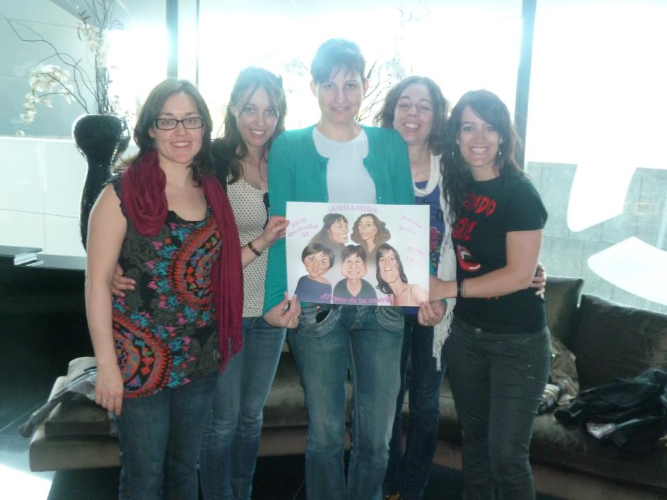
I asked Christine, Helene, Severine, Ethel, Zoe, Carlos, Claire … for some more feedback, put the pieces together and right in time before the midnight deadline I sent the poster by e-mail to the WSD.

Then I checked my other e-mail and saw Guilaine’s feedback from Asia. She wrote that she liked the poster, but suggested to change the order of the colors. It should go from red = bad = waste to green = good = efficiency.
Holy shit. That was a wonderful idea! Why hadn’t I thought of this aspect myself?

I went back to photoshop, changed the colors, it looked much better now, and sent the second version off, 4 minutes before cut-off.

You can see the final poster in high resolution here.

Out of 280 posters 22 posters posters were chosen for the final. My version is one of them.

And the catch is this:

You can choose the winner!

The public will make the final decision and whichever poster gets the most votes will win.

Please help me and my friends who were so kind to help me with their invaluable input. Vote for Poster Number 10 now.

You probably don’t care if I win or not, but Nr. 10 has to win, because with a little price money I will be able to say thank you in style and take my friends who helped me to a restaurant or bar or something. They deserve it and you can make it happen.

What you can do now:

Step 1: Vote for Poster Nr. 10 now
Step 2: Invite your friends to vote for Nr. 10
Step 3: Leave your comment below

Thank you!

Veröffentlicht unter general | Hinterlasse einen Kommentar

New Blog!

This homepage has a new blog now :-).

Some other content will come … asap … one day…


Veröffentlicht unter general | Hinterlasse einen Kommentar